Color plays a big role in our lives whether we realize it or not. It influences our moods and dictates whether a space is dingy and drab or bright and nurturing. Basically, color is one of the easiest ways to change how a space looks and feels. And I’m not just talking about paint.
With the plethora of colors out there, how do you go about choosing the right colors for your home? And beyond that, how do you select a full color palette to incorporate into architecture, cabinetry, furnishings, and accessories? Here are some basic tips for selecting a color palette that will work for your home.
1 – Start with fixed elements
There are elements in your home like flooring and countertops that you may not want to replace and since flooring is a big part of the color palette, these elements should be taken into consideration first. This is also a good time to decide whether to paint bathroom and kitchen cabinetry as these will also make a big impact on the color palette you choose.
Pro tip: If you have dark wood flooring and you don’t like the mid-century or rustic look, go for furniture with lighter, contrasting colors to the flooring. (ie, with dark mahogany flooring, go with a very pale beech or oak, or even white on other wood furniture like dining tables, coffee tables, cabinets, and other storage).
2 – Use a Focal Piece
We all have colors we’re drawn to so start making color selections by pulling from a focal piece you love whether that might be a large rug in the living room or a statement piece of art. Select three colors. If you’re going for a neutral palette, you might select one main color from your accent piece and then use two coordinating colors. A great place to select coordinating colors are paint websites. (I love both Sherwin-Williams and Benjamin Moore for this.)
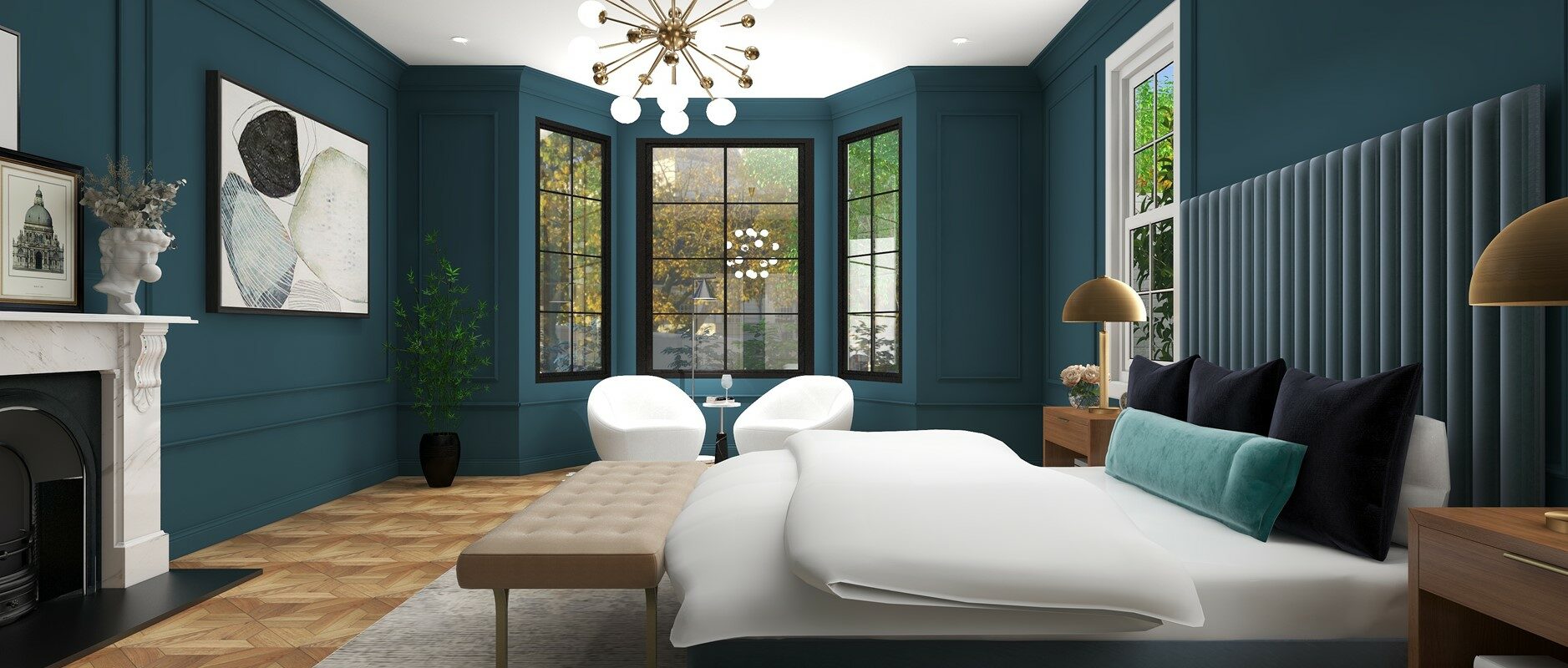
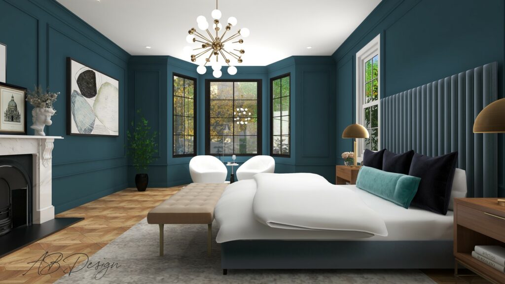
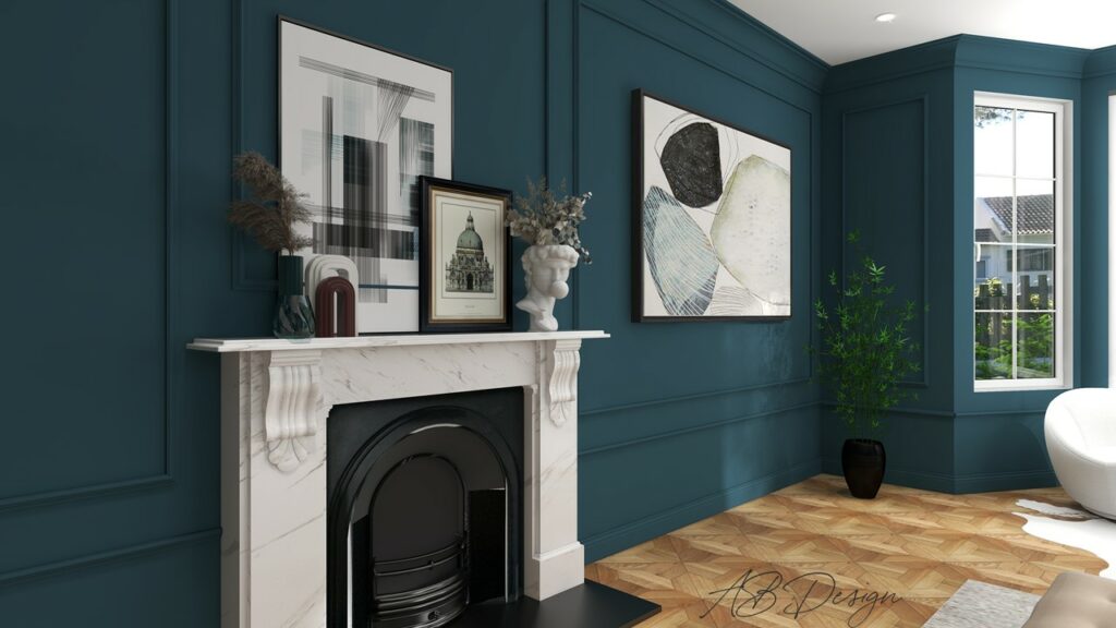
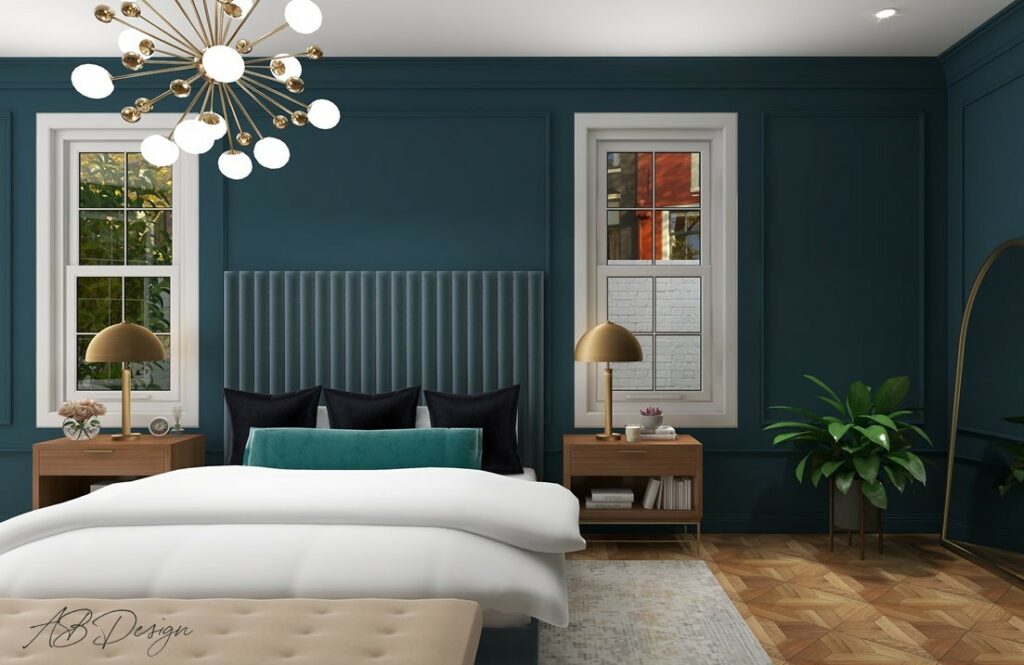
As you can see in the images of the room I’ve used for this post, the art was a great place to pull color from and tie in the warm tones of the flooring along with the blues and touches of black and white.
3 – Use the 60-30-10 Rule
Once you’ve chosen your main three coordinating colors for your palette, you’ll use the main color on the walls (60), the second color on the upholstery (30), and the third on accessories (10).
For example, say you decide you want to use a neutral color palette for your home or room with a pop of color. That pop of color can be any color, of course, but let’s say you used a rug to choose your colors from. Within that rug, the main colors are cream and warm beige along with a little pop of blue. So for your overall color palette you’ll use: 60- Cream/off-white, 30- warm beige (this could also be a warm wood tone for flooring), and 10- blue.
You might decide to only use this palette for one room or for you entire home. For your entire home you can take that color blue and use different tones, whether light or darker, warmer or cooler in each room, or even switch up the ratio of colors for each room. Maybe in your living room you want to stay more neutral, but in your bathroom or guest room you want to use blue as the primary color with your upholstery and accents more neutral.
Still need help with choosing colors for your home?
Stay tuned for next month’s post when I focus on the basics of color (ie, what’s the difference between neutral, pops of color, and bold color palettes? And how to choose between warm or cool color families). For now, thanks for reading!
And don’t hesitate to contact me for a free 15 minute consultation to discuss your design needs!


Leave a Reply