In my last post, I discussed some (hopefully) helpful tips for selecting a color palette for your home. I mentioned terms like “warm and cool” and “neutral” versus “pops of color”. In this post I wanted to dig a little deeper into that terminology to better understand color and how to use it.
Color Psychology – Warm vs Cool
I think a good place to start is to emphasize once more how much color influences our emotions and moods. This is where warm and cool have the most influence. The most basic psychological understanding is that warm colors—red, orange, and yellow—are stimulating and can cause reactions anywhere from mild agitation to open hostility, whereas cool colors—blue, green, and purple—are more calming and restful. (If you’re interested in the psychology of color, I found this article particularly helpful is listing out each color and their psychological effects.)
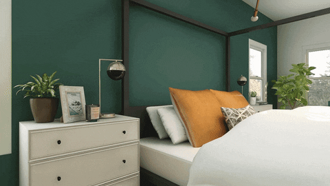
The two color options in the GIF above create a great example of warm vs cool. You can see just from the white wall and ceiling as well as the white chest of drawers next to the bed (yes, they are the exact same white in both images) how much of an impact that one accent color has on the rest of the space. The blue color makes the room cooler, darker, calmer (some might even say it’s a little gloomy or depressing), while the orange is immediately brighter and warmer.
These are generalizations, of course, and everyone reacts differently to color. There will be certain colors that you’re drawn to, and I would suggest following those instincts first, but hopefully, even a simple understanding of color will be helpful in selecting colors for your home.

Color Theory – Primary and Secondary colors
One of the first basic courses I took in design school was color theory where we learned about colors in terms of a color wheel (like the very helpful one above). This is where the terms “primary” and “complimentary” or “secondary” colors come from. When adding color to a space, this distinction can make the biggest difference. Knowing that blue and orange are complimentary colors (in other words, they are opposites on the color wheel, and quite literally compliment each other), helps to better understand why those spaces with light oak wood flooring and accents of blue look so inviting. Or why people like me with pale skin and auburn hair look so good in dark blue (I’m sure by now it’s obvious my favorite color is blue 😉).
Another color theory term is “monochromatic”, which is just another word for using one color. In the design world, this can mean using one color in a room and varying the hues from light to dark (in other words, a spectrum of one color from its purest form all the way to its darkest grey, like the paint cards at Home Depot). It can also mean using many different variations of one color. Blue, for instance, has a wide swath of options ranging from pale sky blue to dark indigo bordering on violet and all the way to turquoise.
A third way to combine color is by families of color: jewel tones, earth tones, or pastels. Jewel tones are the bright saturated varieties of color, whereas pastels are the pale opposites and what I like to think of as Easter colors. It’s rare to see an entire space in pastels, and are more common as pops of color mixed with other brighter, more saturated colors. Earth tones are just what they sound like: colors that can be found in nature (think rust, marigold, deep navy, olive, burnt sienna brown, terracotta, sage, and turmeric) and pair well with natural materials like wood, metal, stone, and leather.
Color Intensity – Neutral, Pops of Color, or Bold
The amount, or intensity, of color that you choose to use in a space is yet another category to consider when choosing color palettes. All three levels of intensity will fall under both of the previous categories: warm or cool, and monochromatic, complimentary, or color families.

Neutral
A neutral color palette usual incorporates hues like black, white, grey, taupe, and beige. Most of the time, the majority of the color (if there is any color at all) in a neutral space is coming from wood flooring, rugs, art, and accents like pillows and other accessories. This space above is a great example of a warm, neutral color palette with just some subtle pops of earth tones, which always pair well with a neutral color palette.
Pops of Color
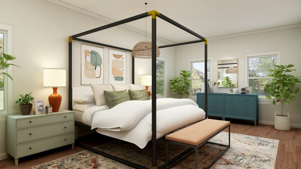
I personally love adding pops of color to a space. It’s one of the simpler options because it usually involves adding color through furniture and accessories. This example above is a great example of a complimentary (blue and orange) color scheme with pops of color. Whether it’s warm or cool is a little tricky (as with most complimentary color schemes). Most of the furniture and accessories providing the actual pops of color are cool, though the rest of the space: the walls, flooring and even the rug, are warm. Overall, it’s a very inviting, serene, and satisfying space.
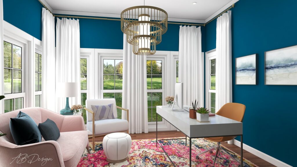
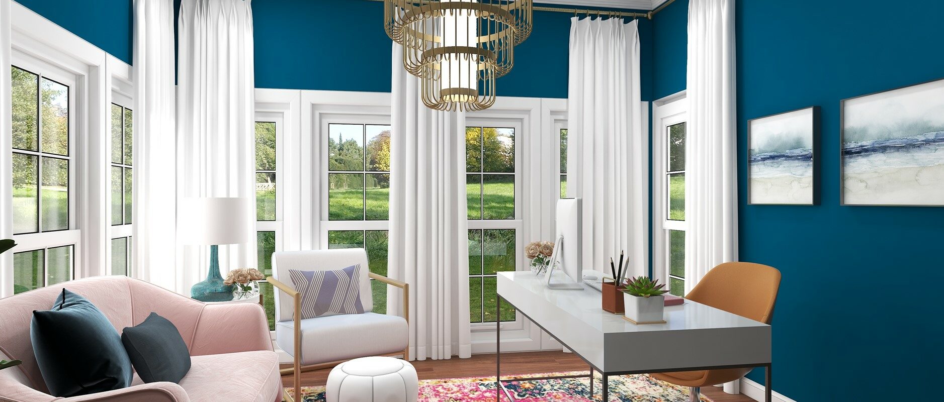
Bold
I’m very much a fan of bold color palettes and I love infusing my projects with color! It’s easy to think of a bold color palette as being overpowering, but it doesn’t have to be. The example above shows just how invigorating color can be in a space while still being balanced and even calming. The warm tones of the furniture, rug, and flooring help balance out the cooler blue, and the white curtains and window frames keep the blue from overpowering the space.
By now, I hope you understand color a little better, and perhaps you might even feel inspired to add some color to your space!
Still need some expert advice? Don’t hesitate to contact me so we can discuss your design needs!


Leave a Reply